


When design meets depth
A New Era for iPhone Visuals
Part of the excitement when Apple released iOS 26 in September 2025 was not just about the fresh apps, devices, or features—it was also about how the interface looks and feels. Originally seemingly unimportant, wallpapers are having a moment in this edition. They now influence your phone experience actively, not just as backdrop. iOS 26 promises wallpaper experiences that seem more alive, more personal, and more dynamic than ever with "Liquid Glass," adaptive clocks, spatial scenes, more. This post will investigate developments in iOS 26 wallpapers, design adjustments impacting appropriate wallpaper types, where to Find excellent ones and advice on selecting wallpapers that make your iPhone feel yours.
Dynamic Design and Liquid Glass
iOS 26 brings in a few wallpaper-oriented enhancements that turn them into something more than merely attractive images. The most major modification is the fresh Liquid Glass design language, which stresses subtlety, depth, and transparency. Your wallpaper currently interacts with interface elements like icons, widgets, and menus to give the whole screen a sense of a single coherent layer rather of stacked cards.
Smarter Lock Screen and Widgets
To change dynamically with your background, the lock screen clock has also undergone renovation. The clock can change or resize so it doesn't obstruct the subject if your wallpaper has a definite theme—a person, animal, object. Widgets provide a more polished appearance by moving somewhat.
Spatial scenes enhance the depth of life
Another significant improvement is spatial visuals. This functionality separates objects from backgrounds using depth detection, therefore creating a delicate 3D parallax effect while you rotate your iPhone. It is slight, but it gives the Lock Screen more life.
More control over icons and widget style
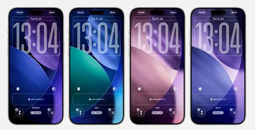
Apple also gave you the opportunity to design your wallpaper to match your home screen with a variety of levels of symbol transparency, tints, and widget backdrops. And naturally, iOS 26 has a fresh collection of default wallpapers meant to highlight these features. Each of four primary themes—Sky, Shadow, Halo, and Dusk—is offered in light and dark forms.
Why Wallpaper choices matter
These modifications improve iOS 26's daily usage by means of adjusting text and widgets to your wallpaper, rather than just for appearances. Readability, which occasionally presented problems in earlier editions when white text conflicted with active backgrounds. It also lends your phone more personality and maintains freshness since even the basic gesture of unlocking it seems a little bit different. on the kind of wallpaper, you pick.
What Makes a good iOS 26 Wallpaper?
Although not all wallpaper perfectly complements these characteristics. Some are better adapted to the fresh design language. Depth effects work especially well with wallpapers with a crisp subject in the foreground and a soft or fuzzy backdrop. For the Lock Screen, clean photos with enough negative space are best as they provide the clock and widgets opportunity to breath. Very active or noisy wallpapers might make the interface look messy and impair text legibility. Choose a wallpaper carefully, making sure notifications, icons, and widgets stay visible and checking its appearance with both light and dark modes.
Finding the perfect Wallpaper
Numerous sources for premium wallpapers exist if you want to go outside the default choices. Because they are built to go flawlessly with spatial effects and Liquid Glass, the standard Apple set is a good choice. Many wallpaper apps and websites now have collections customized for the characteristics of iOS 26, with themes positioned to let the clock drift behind them. Or near clean spaces for maximum legibility. User-created solutions abound in Reddit threads and community forums that interact well with the innovative adaptive design. Naturally, you may always use your own images—portraits, landscapes, and travel shots frequently translate well into spatial scenes when converted.
Great iOS 26 Wallpaper Samples
Examples of wallpapers that would work very well in iOS 26 are scenes featuring one major object, portraits with softly blurred backgrounds, and minimalist abstract art with Warm dusk or night landscapes that match the dark mode of the system and smooth gradients. Particularly when combined with depth effects, travel pictures with distinct subjects like a mountain, memorial, or skyline also work well.
Challenges and things to watch out for
Knowing of a few potential downsides. While those with too much saturation or too much brightness can impede text legibility, wallpapers with too much contrast can be aesthetically tiring. More processing power is called for by depth effects and liquid glass rendering as well, which could somewhat shorten battery life on older devices. And because the icons and widgets are clearer now, wallpapers with contrasting colors can make the whole appearance seem disheveled.
Tips for getting the best Look
Start with high-resolution photos so they remain crisp when depth effects are added to make the most from the wallpaper features of iOS. 26. Always view your wallpaper with the lock screen and home screen overlays before finishing it and change the subject's position as needed. The clock widgets likewise conceal nothing significant. Play around with icon tint and widget design to suit your chosen wallpaper and provide a harmonic look. You may even set your phone to cycle between several wallpapers during the day for a new experience.
How Users Are Reacting
Users mostly have welcomed the updated backgrounds. Many people think the way the clock may now be positioned behind objects makes the lock screen look like a magazine. The liquid glass aesthetic enhances the interface's elegance and futurism. While others have doubted clarity with busy backgrounds, Apple's alterations to transparency levels since the beta have mitigated these issues.
Final Comments
Wallpapers in iOS 26 are viewed as more than just aesthetics. These people now make live elements of your phone's personality, therefore influencing the appearance and feel of the interface all day long. Whether you use Apple's official designs or bring in your own images, iOS 26 provides tools to let your iPhone's display appear as desired. Your own sense of flair interpreted in a specific way.


Write your comment